The target audience are females in between 12 - 16 for my magazine article and album cover alike. The magazine interview appeals to my demographic because my artist relates to my demographic because she talks about her past experiences through responses to the questions I asked. I feel that the quote catches the audiences eye because it seems like a nice and inspiring thing to say. I only used two main colors, to keep the interview appear more professional but simple, the colors I used are pink and blue, which help the page look brighter and more appealing, making my artist seem more fun and easy going but serious about her music - like how I tried to portray her in the photo on the right side of the interview.
I think it could be suitable to feature in a magazines like Tiger Beat or others - which are targeted at a younger teenage audience, who perhaps like my artist, are aspiring musicians looking fro their big break, and as my interview is set after she released her debut album, it could be inspiring to an area of my demographic, whilst the others (in the demographic) would just be looking forward to being introduced to a new musician.
I followed the convention of using one whole page for a photograph and of using a drop cap to start my interview because it attracts the eye of the demographic immediately, causing them to read on. The photograph portrays the artist in a good light, encouraging the audience to read the interview to find out more about the subject.
My album cover is appealing because it connotes very emotional thoughts, and I feel that it portrays my artist as sweet, inspirational and intelligent and because I used indirect address, which makes it seems like her thoughts are private, personal and important - like the person the everyday teenager wants to be. They would look up to her, as if she were a role model. I also used a widely known landmark - the Big Ben - as the backdrop because it connotes ideas of adventure and it also fits in with the title of the album - Timeless.
In both my interview and album cover, the artist is represented as down to earth and sweet, as mentioned before they both make her seem thoughtful by using indirect address in both photographs, creating synergy between them.
Recently, we got the opportunity to sit down and talk to one of the most recent rising superstars in the music industry. She became a big hit during her days on X-Factor before she disappeared from the public eye...but now she’s resurfaced and climbed to the top of the charts with her debut album Timeless. It’s Ash Bourne!
When and how did you first become interested in music?
I first became interested in music at very early age, about when I was 7 years old. It’s actually made a very big impact on my family. So, my dad owned an instruments shop in London, before we moved to Oxford. Right before we moved there, my dad gave me a guitar. I was always interested in my dads business, but when I started playing the guitar, I realised I wanted to do it for a living.
Did you face any obstacles in pursuing your career?
Yes, definitely. I remember there was this one instance where I really doubted my chances at success. It was when I was eliminated from X Factor in the semi finals. No record label was giving me a chance and my agent nearly gave up. Luckily, Kronos Records gave me a chance. I just hope my album will receive a positive reception.
Did you learn something from your elimination on the X Factor?
My elimination caused me to face the fact that I wasn’t prepared to proceed to the next round and career, so I contacted a vocal coach and started to train my voice to become more stronger. My voice cracked on the song I was singing in the semi final because I couldn’t reach the high notes in it. I’m actually happy that I went through this experience because it helped me feel better about my chances for a successful career due to the hard work and effort I put into those classes.
What are your musical influences?
Zendaya’s dual career in both acting and singing was so successful that it inspired me to pursue a career that balanced both of these things as I grew up loving them equally through my childhood. I also grew up loving Michael Jackson, he made such a big impact on the music industry and really shaped how music is in the present. He is one of the most famous and inspiring legends ever. I really hope to put my own mark on the industry and leave a legacy behind just like he did.
How do you write and compose your songs?
Well, first I compose the music by trying out a few chords together on my piano and then I add in any other instruments I think would make the song sound better. Then, I pick out an experience that Ive gone through and jot down any lyrics that come to mind on the nearest object I can write on, most of the time it’s in my journal.
Do you have any advice for any young, aspiring musicians, like yourself?
Yes. I do. Never give up on your music and yourself, despite what others tell you. Music is a way to express yourself freely, without holding back. That’s what I like best about it. Never let anyone stop you from achieving your dreams.
What’s the inspiration behind your album?
I wanted to write songs about the different phases in my life and how they all made me the person who I am today. I wanted to show my appreciation for my childhood and my life so far and the only way I could do that was through my music. The memories from those times were - are eternal, always to me.
The artist I am analysing is called Lindsey Stirling, she is signed to multiple record labels, but this alum was released by Lindseystomp Music. She is most commonly advertised through the use of YouTube where she has exceeded 8 million subscribers as of July 2016. YouTube allows Lindsey to directly connect with her fans and sell her albums. I am analysing the music video for The Arena and the album it is from called Brave Enough, both originals by Lindsey Stirling.
The Arena by Lindsey Stirling
The genre of her music is very unique as not many people put out this type of music. Her songs are a mix of classical and pop and some, like this one, are purely instrumental.
As her style of music is so unique it is hard to name conventions for it. She breaks many conventions of classical and pop alike by combining the two clashing genres. There is a lot of dancing in the music video which occurs a lot in this genre and her portrayal of this fusion of classical and pop sounds very cool and shown accurately through the style of her music videos. She is also shown for the majority of the music video.
Although, this music video is tailored more towards a demographic of teens and young adults as her music is upbeat and fun to listen to for this target audience. A secondary demographic may be fans of the classical genre and they may like this refreshing take on their preferred genre. The pace of the dancing constantly holds the attention of the target demographic because they normally have a short attention span.
Throughout the video, the artist constantly has a confident NVC which is indirect. This shows that she is completely focused in her actions. The lightning is bright which connotes purity, empowerment and courage in this specific narrative. She has two different costumes in the video. The audience first sees her in dark clothing which represents her a rebellious but serious about what she believes in. Her second costume is bright and the complete opposite of her previous costume. She is seen in this costume whilst she is playing the violin. This connotes angelic, hope and purity, and since she was playing the violin it makes the demographic understand that this song is about hope and courage.
The video starts with a historical and inspirational quote by Winston Churchill and this immediately catches the eye of the audience as they start to wonder how this can be related to the artist's music. Then, the quote shortens to a single sentence and then a phrase. The phrase is the title. This makes the audience intrigued. There are quite a few slow motion shots to create drama and there are many long takes with wide shots for the audience to perceive the setting and mise en scene. They are clearly in a arena being watched by a surrounding audience and the two main characters are dancing, which is very unusual. But, this shows that they are "brave enough" to dance in front of an audience that can potentially mock them. This is followed by other characters to become "brave enough" because they are inspired to do whatever they want to do, by the music in the music video. This gives an overall empowering feeling.
Overall, the artist is represented as inspirational and courageous through her costume choices and actions in the music video. She is constantly represented as a mentor/ revolutionary figure as she consistently inspires others to believe in themselves, offering them hope when they appear to have none. She is also represented as a fighter, it is shown that she views herself as her biggest critic, but even when she is upset, she never gives up - which also shows the extent of her hopeful nature.
The title of the album is portrayed clearly through the pose of the artist. It connotes breaking free, rebellion, courage and gracefulness. It could suggest that she is brave enough to break free from conventional stereotypes of anything.
The colour scheme is dark which contrasts against the artist which makes her stand out. She is also in the direct centre of the album cover which connotes being the center of attention and importance.
Her costume is dark which connotes rebellion, her costume also looks very classy as it has a nice sheen to it. She is surrounded by a piece of fabric which could have been her skirt because the object around her waist is left exposed. It seems that she has restrictions placed on her and all she wants to do is to break free. The light white upper half of her costume also gives the outfit a more sophisticated portrayal.
Lighting used is low-key around her but very high-key when placed on her, this could suggest how hopeful she is and how she stands out from others. Her NVC uses indirect address but is confident, which attracts the audience as it looks a bit more realistic and personal.
The title looks modern which attracts the attention of the audience as they begin to ask questions about the artists work. As the title is modern, any new members of the demographic would be confused at the relationship between the violin, portrayed elegantly, and the modern, futuristic title.
The synergy between the two products is quite subtle but it can be seen through the relevant narrative in the music video to the album. Since it is subtle, it is also effective as the audience would be intrigued by the cover and see a music video that would persuade them to buy her album, since they liked the music video they would be interested in her other songs in the album. On the other hand, if they saw the music video and then the cover they would most likely detect a recurring message through her songs and cover: to be 'brave enough'.
In Conclusion, I feel the artist is represented as inspirational and courageous, through mise en scene, lighting and various production techniques. It is also advertised well throughout several forms of media (music video and album cover) on different platforms(such as YouTube). The synergy between the two forms of media is quite evident and doesn't seem that there is a repeat in a narrative from the other form in another.
My fragrance print advert is targeted to a demographic of young female adults aged 18 - 25. My advert appeals to my audience because the model is portrayed as a seductive mermaid - a siren. A siren is a mythological mermaid who would lure sailors to rocks, so my mise en scene is suitable to my narrative in this advert. The setting is a beach and the model is placed in the centre of the advert because it shows that she'll always be the centre of attention - the demographic will most likely want to be like her. She is also having an indirect NVC to show that she has many secrets and how she is mysterious. I mainly used blues because they connote seas and water. I have followed the convention of portraying females as seductive women, but the model is also represented as more powerful and more dominant over men because the model is portrayed as a siren. I feel like magazines aimed at my demographic would promote this advert, dependent on what they may focus on.
The narrative represents the male
model as victorious and successful. The male model is also depicted as if he is
a roman god. This narrative may appeal to the demographic of middle aged men -
around 30 - 40 - as the model has the appearance of someone in that range. The
advert makes them think that they need this to aid their lifestyle they will
aspire to be successful like how the model is portrayed in the advert.
The only prop used is the big trophy placed on one of the model's shoulders.
This prop connotes the main message of the advert: victory, as trophies as
usually symbols of triumph. The size of the prop appeals to
the demographic as it defines the competition it was won from to be
significant. The model's NVC is directly addressing the audience and his body
languagerepresents that the model is confident. This makes the advert seem more
personal to the target demographic, influencing them to purchase the product as
they are lead to believe this perfume is vital for their lifestyle. Lighting
used is very high-key connoting heaven and gods as if he is worshipped as a
god, this is emphasized through the use of angels holding the cup and the
tattoo of a cross – which is a religious symbol in Christianity associated with
God. The model's costume, or lack thereof connotes fitness and health through
the portrayal of the model’s muscular body. This choice of costume appeals to
the demographic as they will all aspire to be fit because men around this age
are perceived to be more lazy and overweight. The model is placed in front of a
backdrop consisting of clear white clouds as if he is in heaven or he is the
target audience’s fantasy, something that they aspire to be.
The name of the brand is in the middle of the advert and is very clear and
bold. The silver font used connotes a strong connection to the image and
message of the product advertised. Silver connotes pure, strong and godlike as
it is expensive to own. The product name and font used emphasises the view of
the model: as a Roman god. The advert has a hard focus which emphasises the
direct address to the audience.
The Uses and Gratifications theory by Blumler and Katz is used in this advert
to appeal to their demographic. The brand has used this theory by making the
model convey a personal message to the demographic through his expression.
Their demographic would appeal to this advert as the model is what they aspire
their personal identity to be, this is because the demographic are insecure
around this age range, as they compare themselves to younger men. They wish to
see their personal identity reflected in this advert.
This advert convinces the audience that this product is essential to become
what they aspire to be: handsome and successful, through mise en scene and
choices of lighting, colour and font. A secondary demographic may be the
partners of the primary demographic.
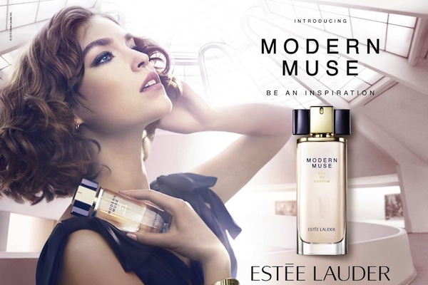
The narrative in the second advert
portrays the model in an art gallery, and a muse for a piece of artwork. The
demographic this appeals to is young adults - 18 to 24 - since the model
appears to be around that age range. This advert makes the target demographic
feel as if they will be the focus of everything and will gain a lot of
appreciated attention. Women at this age usually feel very insecure about the
adult world of business and work. They are led to believe that this product
will make a very good impression on people and they will be the main subject of
conversation - in a good way.
Only one prop is used in this advert: the product. This makes the prop more
relevant to the narrative as it is as if she is a muse because of this product.
The idea of the advert occurring in an art gallery makes very clear that the
model is modeling for something or someone by her indirect gaze and how she is
posing. This could be for a piece of artwork or sculpture. The model's NVC is
indirect connoting secrecy. The person whom she is modeling for seems as if
he's her lover because her pose seems romantic, seductive and secretive. The
brand has used the lines of appeal by Dyer to tap into the target demographic's
desire of self importance, pride and a successful romance. Her costume seems
very elegant and beautiful which connotes success. Her costume also supports
the idea of being a muse, or a 'modern muse' as the name implies.
There is
a light shining down on her and her background has a pink hue due to the
lighting used. This lighting connotes romance because of the effect it has on
the backdrop - giving it a pink hue - and angelic, as the model is being
represented as a muse, an inspiration, the lighting makes the target
demographic idolize her in some way. The lighting and the colour scheme
support each other as they both connote romance with their use of light pink.
The name
and actual perfume are given a complete side connoting the importance of the
product in the narrative, by the layout of the advert. The font itself of the
name is very modern, linking to the name of the product. The slogan is "Be
an Inspiration" this slogan is seen through how the model is portrayed as
an inspiration.
This
advert represents the model as an idealistic version of the target demographic
that they wish to be themselves. The advert is made more effective to the
target demographic through use of mise en scene, the lines of appeal, the font
colour and type, slogan etc.